
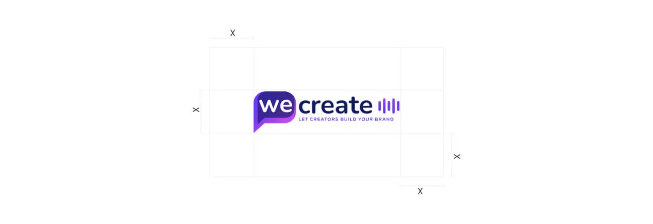
Primary Logo - light background
Download logo
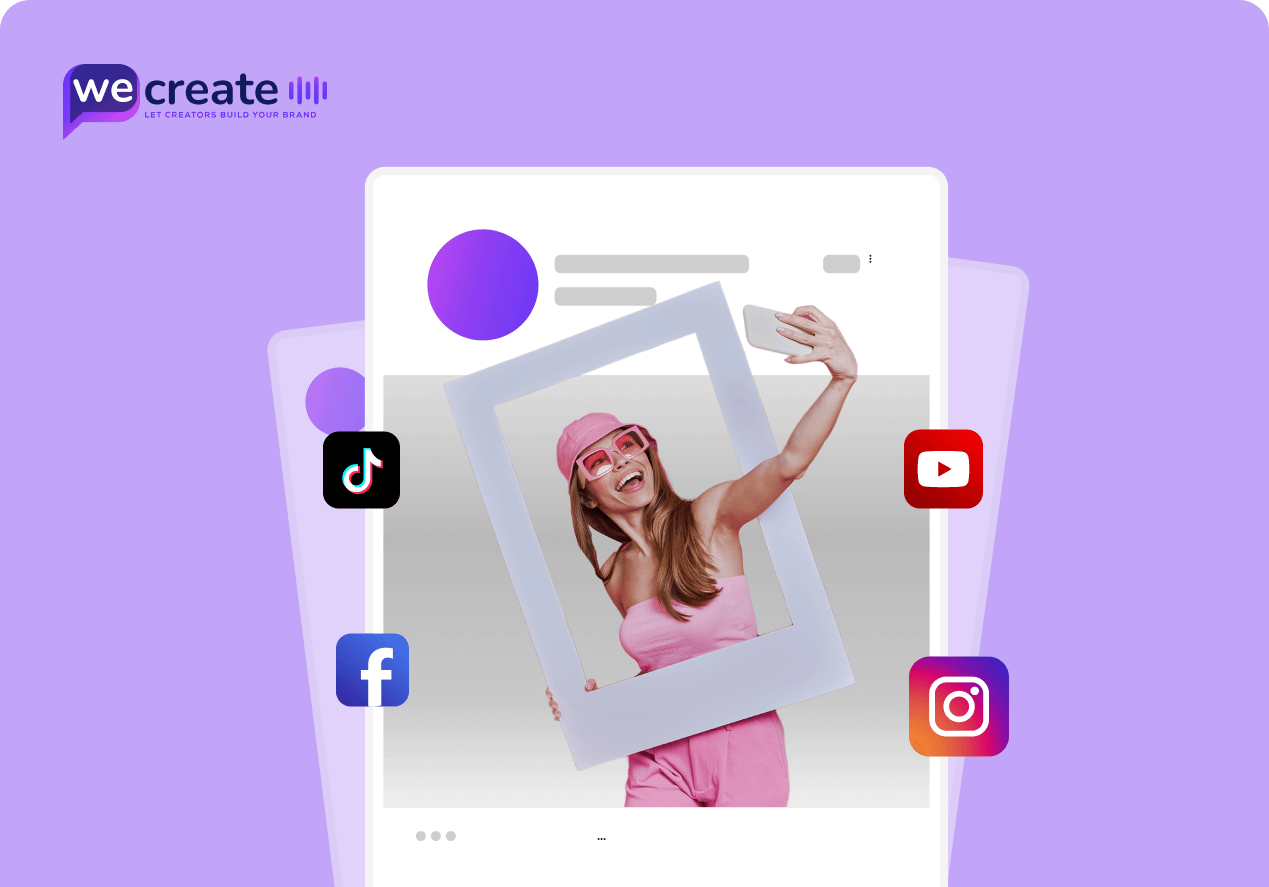
WeCreate.lt is a digital marketplace tailored for brands seeking top-tier content creators across Lithuania, the Baltics, and Russian-speaking markets. From UGC specialists to SEO experts, WeCreate.lt bridges the gap between companies and pre-vetted creatives in an intuitive, managed platform. Our multilingual, regional focus ensures that businesses can scale brand content with creators who understand local culture and global trend
To empower businesses with reliable, flexible, and high-quality content by connecting them with verified creators and professionals. We simplify the hiring process and eliminate the chaos of unfiltered platforms.

Logo Meaning & Symbolism
The WeCreate icon is a simplified yet powerful representation of the brand. It isolates the core visual element — the speech bubble enclosing “we” — and enhances it with a dynamic gradient and three vertical bars, symbolizing creativity, media, and motion.
Symbol Breakdown
To maintain legibility and visual impact, always surround the logo with adequate clear space.
Incorrect Usage Examples (Don’t do this):
At WeCreate, we’re more than a platform — we’re a movement empowering creators to shape the brands of tomorrow. Our foundation is built on trust, creativity, and collaboration. These guiding values set us apart in the content-driven digital economy.
Creator-First Philosophy
We champion the power of individual creators. From micro-influencers to industry experts, we give them the tools and freedom to co-create meaningful brand stories.
Seamless Brand-Creator Collaboration
Our platform is built to bridge the gap between brands and content creators through intuitive workflows, smart matchmaking, and real-time communication.
Authentic Content, Real Impact
We prioritize authenticity over virality. Every campaign is driven by relevance, audience trust, and content that feels real — not forced.
Scalable, Data-Backed Solutions
From campaign insights to performance metrics, our tools help brands grow confidently — with transparency, efficiency, and ROI in mind.
The WeCreate color system is bold, digital-native, and designed to communicate creativity, reliability, and modernity. The primary palette blends vibrant purples with grounded neutrals to maintain balance across visual media.
Base Color – Purple
Primary color
WeCreate’s core brand color — a bold, modern purple that reflects innovation, creativity, and digital-forward thinking. It combines the trust of blue with the energy of red, making it ideal for a platform that empowers creators and connects them with modern brands.
Accent Orchid
Accent Color
A vibrant, energetic violet-pink tone that adds a dynamic, creative flair to the brand identity. It works perfectly for call-to-actions, highlight elements, and youthful brand accents that appeal to creators and digital natives.
Secondary Brand Color – Deep Indigo
Secondary Color
This rich indigo serves perfectly as a background or supportive UI layer — especially in dark mode or premium layouts — allowing accent elements like typography, buttons, and icons (especially in white or #873DF2) to stand out with high contrast.
Neutral Color: White
Typography contrast | Whitespace
White (#FFFFFF) is a foundational color used to provide clarity, contrast, and balance within the WeCreate visual system. It serves as the primary background for layouts, ensuring content readability and clean visual hierarchy. It enhances the vibrancy of your core colors like #873DF2 and #2FE6DE.
Typeface: Montserrat
Style: Geometric sans-serif
File Type: Google Font (web-safe)
Usage: Free for commercial and digital use
WeCreate uses Montserrat for its modern, geometric design and high readability. Inspired by urban signage, Montserrat gives the brand a clean, digital-native look that feels both approachable and professional. It balances creativity and structure—perfect for a creator-driven platform.
| Element | Font Size | Weight | Line Height | Use Case |
|---|---|---|---|---|
| H1 | 40–48px | Bold | 120% | Main Heading (H1) |
| H2 | 32px | Bold | 120% | Section titles, banners |
| H3 | 26px | Bold | 120% | Subsections, feature highlights |
| H4 | 22px | Bold | 125% | Smaller headings, cards |
| H5 | 20px | Bold | 130% | Labels, subtitles |
| H6 | 18px | SemiBold | 130% | Minor headings, callouts |
| P | 18px | Regular | 150% | Paragraph text, descriptions |
Montserrat offers a clean, geometric structure that aligns with digital aesthetics. It is versatile, highly readable, and contributes to a strong and modern brand tone.
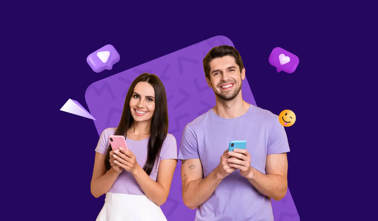
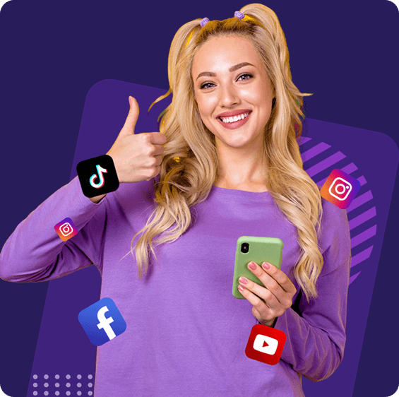
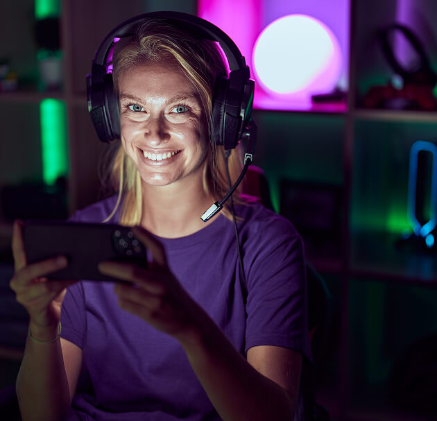
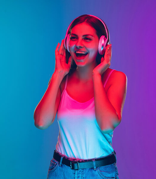
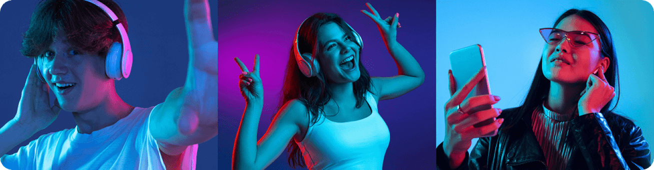
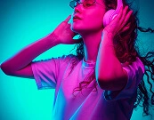
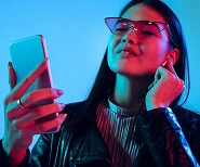
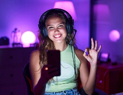
In a platform built to connect businesses with creators, visual storytelling is everything. The imagery and iconography used by WeCreate.lt play a central role in shaping how users perceive the brand — approachable, trustworthy, professional, and future-facing.
Our visual assets aim to represent not just a digital service, but a community of real people. They reflect the diversity, talent, and authenticity of our creator network. From lifestyle shots of creators at work to clean, elegant icons guiding user interactions, everything contributes to an intuitive and emotionally engaging experience.
What We Stand For Visually

Icons are used for navigation, services, and explanations. The visual signature of WeCreate icons includes:
The layout philosophy emphasizes clarity, modularity, and conversion-driven UX.
Grid System
Element Styling
Cards: Rounded corners (16px), subtle shadows
Forms: Clean inputs with rounded edges (50%), clear labels
Buttons: Pill shape, bold text, hover animation
WeCreate.lt’s brand voice is confident, human, and supportive. As a bridge between businesses and creators, we speak with clarity and purpose — always focusing on connection, creativity, and professionalism.
Our tone balances approachability with expertise, helping users feel both empowered and guided as they navigate the platform.
Your communication should always reflect the WeCreate brand tone — whether you’re writing a homepage headline, a support email, or a blog article.
WeCreate.lt’s messaging reflects our mission to empower businesses through authentic, creator-driven content. Every word should reinforce the platform’s unique value while remaining clear, human, and results-focused.
Speak to Empower, Not Just to Sell
We’re not just offering services — we’re enabling creators and brands to grow together. Our language should reflect that mission. Focus on benefits, possibilities, and outcomes.
Simplicity Over Buzzwords
Simplify technical details without oversimplifying meaning. Break down concepts like tax planning, digital registration, and mergers in layman’s terms—unless writing for specialists.
Value the Human Connection
WeCreate.lt is powered by real people — not algorithms. Messaging should highlight personal matchmaking, real relationships, and collaborative creativity.
Local-first, Globally Minded
WeCreate.lt is proudly based in Lithuania, with expansion across the Baltics and Eastern Europe. Celebrate local talent, but keep language accessible to a multilingual, multi-market audience.
| Context | Example Tone | Sample Phrase |
|---|---|---|
| Homepage/Marketing | Confident & Inspiring | “All-in-One Content & Branding Marketplace.” |
| Platform UI/UX | Friendly & Clear | “Let’s build something together.” |
| Support Emails | Warm, Reassuring & Helpful | “We’ve received your brief — our team is on it.” |
| Social Media | Human, Casual, Insightful | “Creator tip of the week: Script like a human, not an algorithm.” |
| Blog | Expert, Engaging, Practical | “5 ways to make your UGC content stand out in 2025.” |
The WeCreate.lt brand voice is a reflection of who we are: real, helpful, creative, and human-first. These do’s and don’ts ensure that every touchpoint — from social media posts to customer emails — consistently expresses our personality and values.
Do
Don’t
“Disruptive omni-channel influencer synergy for 360° campaigns.”
“Your inquiry has been received and will be processed shortly.”
“Click here to explore, submit, browse, sign up, log in or chat.”
Don’t try too hard to be “funny” or “trendy”
“Get clout, not doubt. Slay your socials 💅🔥.”
“Upload now. Complete the form. Proceed.”
The WeCreate.lt website is the primary digital experience for users. Every interaction — from homepage visits to brief submissions — should feel intuitive, welcoming, and consistent with our visual and verbal identity. Design should serve content. Functionality should support conversion. Clarity is key.
Simplicity First
Clear top-level menu with intuitive paths. All pages should be reachable in 3 clicks or less.
Mobile-Optimized Always
The platform must work flawlessly on mobile devices. Responsive design isn’t optional — it’s the default.
Use Clear, Action-Oriented CTAs
Example: “Submit a Brief”, “Explore Creators”, “Start Now” — not vague links like “Learn More”.
Consistent Brand Styling
Fonts: Montserrat only. Colors: Deep Violet, Slate Gray, White. Buttons, forms, and cards must follow defined UI spacing (see Visual Identity).
Highlight Creator Stories
Use real faces, testimonials, and “About Me” sections to humanize the platform. This builds trust.
Prioritize Speed
Fast loading times, alt tags on images, readable contrast ratios are part of our commitment to inclusivity.
Our goal is to be easily discoverable by businesses and creators across Lithuania, the Baltics, and beyond. SEO (Search Engine Optimization) and AEO (Answer Engine Optimization) ensure that WeCreate.lt is positioned as the go-to platform in organic search and AI-generated responses (e.g., ChatGPT, voice assistants, smart search previews).
Key Principles
Start with Intent-Based Keywords
Use real phrases that users search for: “Hire UGC creator in Lithuania”, “Best branding services Baltics”.
Use Semantic Markup
Proper H1, H2 hierarchy, meta titles/descriptions, image alt texts, schema markup (JSON-LD) for creators, reviews, and FAQs.
Create Answer-Friendly Snippets
Use question-style headings and brief, direct answers to boost visibility in Google and AI results.
Local + Multilingual SEO
Optimize pages in LT / EN / RU, with proper hreflang tags and localized metadata.
Fast, Mobile-First UX
Site speed and mobile usability are Google ranking factors. Optimize all media and scripts.
Structured Data for Creators
Treat each public creator profile like a mini SEO asset — include meta info, alt tags, and descriptions with keywords.
| Goal | Use |
|---|---|
| Creator Discovery | “Top content creators in Lithuania” |
| UGC Offer | “Buy UGC video packages from verified creators” |
| Blog Article Title | “How to use UGC to grow your brand in 2025” |
| Voice Assistant Intent | “Where can I find branding experts near me?” |
| Platform Value | “All-in-one content and branding marketplace” |
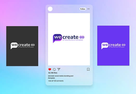
Social media is where WeCreate.lt amplifies its voice, engages the creator community, and builds trust with businesses. Every platform post is an opportunity to reflect our brand tone: creative, expert, and approachable.
Creator Spotlights
Highlight top creators with mini profiles, samples, or interviews. ”Meet Laura, a UGC expert with over 200 branded videos.“
Educational Tips & Tutorials
Share actionable tips on content strategy, SEO, branding, and creator marketing. ”3 ways to brief a creator more effectively.“
Behind-the-Scenes
Show the process of building WeCreate: new features, team updates, platform growth. ”We’re now live in Lithuania! “
Blog Snippets & Case Studies
Link back to platform blog with teaser posts or quotes. ”How UGC helped a Lithuanian brand 5x their engagement.“
Community Quotes & Testimonials
Short, social-friendly quotes from creators or clients. ”‘The brief process was so smooth — I’ll be back!’ – Andrius, client.“
Announcements & Campaigns
New features, bundles, deadlines, or creator calls. ”New UGC starter pack — only €149 this month!“
Primary Channels
For creator content, stories, reels, and testimonials
TikTok
UGC culture, behind-the-scenes, creator tips
Multilingual community building, blog links, announcements
YouTube
For long-form creator interviews or video tutorials
B2B thought leadership, client case studies, platform credibility
For internal creator communications only


This section defines how our brand is applied across physical merchandise, internal documents, and external communications — all while maintaining the core visual and tonal integrity outlined in previous chapters.
Branded print materials and merchandise are often the first physical touchpoint between WeCreate.lt and its community. Every item should reflect the same high-quality visual standards and values we promote online.
Business Cards
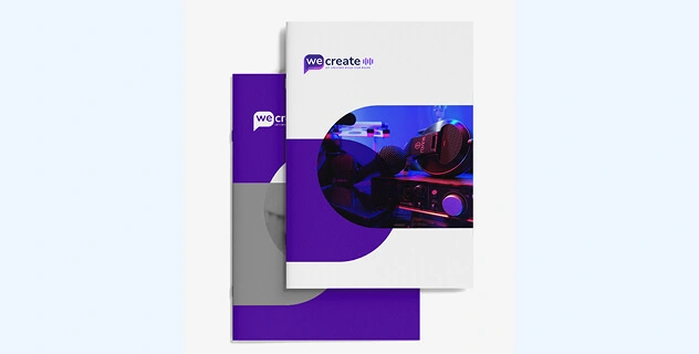
Brochures & Flyers
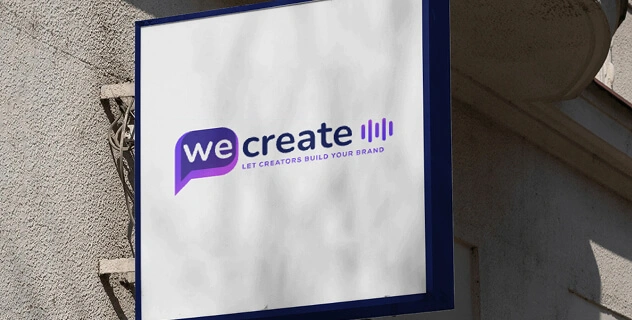
Banners & Signage
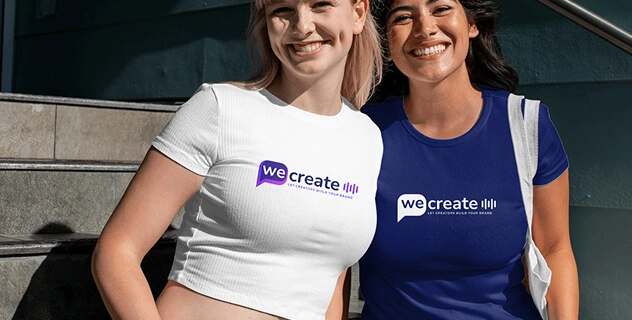
Uniforms & Accessories
Consistency in communication helps build trust and professionalism, especially in client-facing or creator-onboarding messages.
Email Signatures
Visual Notes:
Document Formatting Rules
Video Content
Tone: Real creators, natural lighting, local scenes
Format: Reels, TikToks, testimonial edits, “How it works” explainers
Specs: Always 16:9 and 9:16 formats for flexibility
Use the slogan or taglines visually and audibly in closing scenes
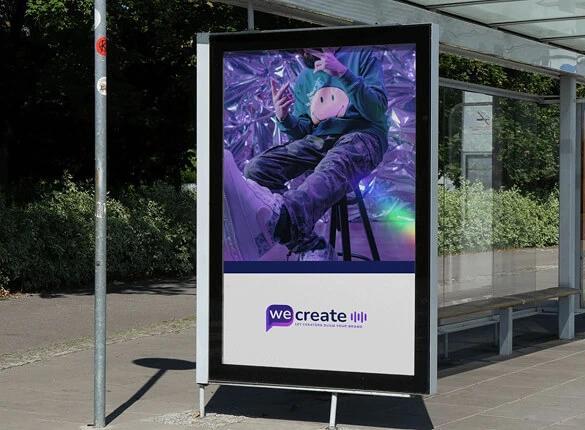
Ad Creatives
Design: Modular, headline-focused, clean white space
Copywriting: Short, bold, value-first (e.g. “Hire creators who get your brand.”)
CTAs: “Submit a Brief” / “Explore Now” / “Start Building”
Advertising & Media – Sponsorships & Partnerships